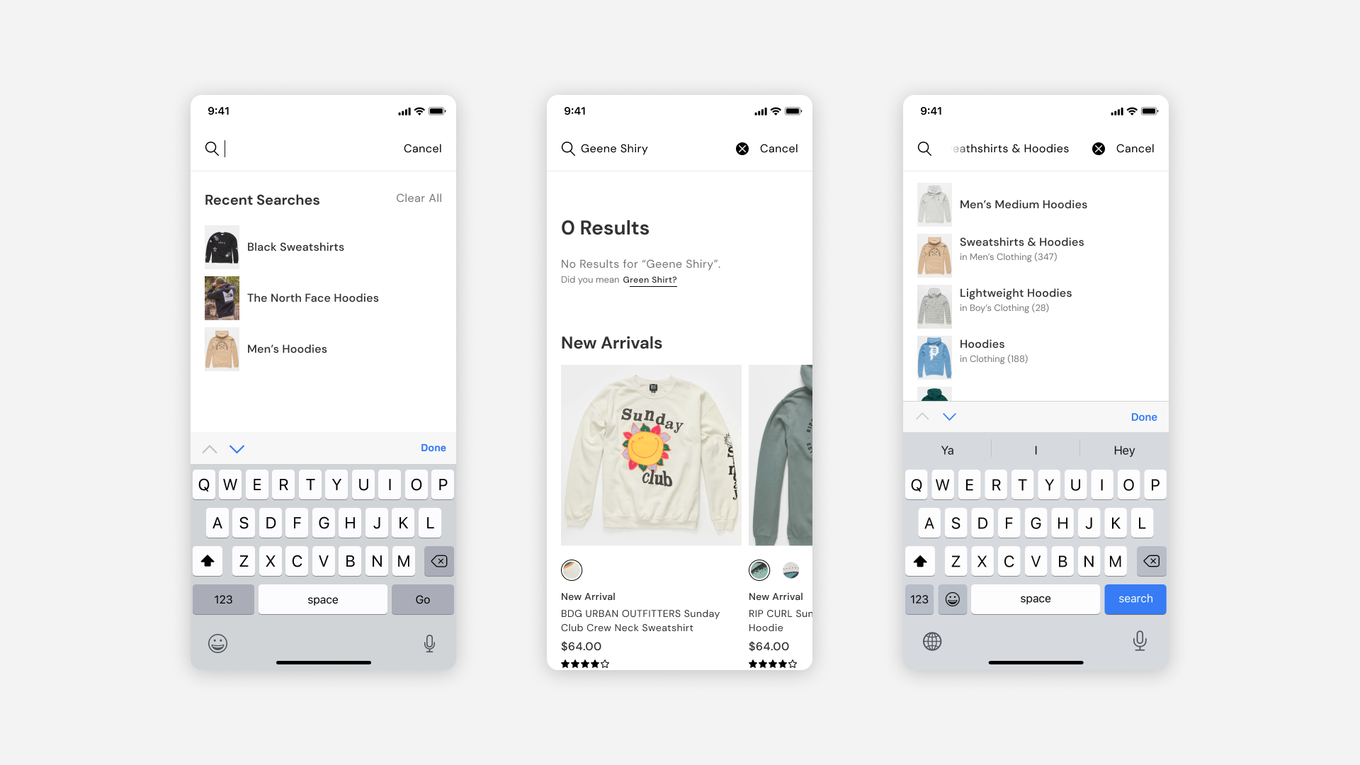
After designing my first UX project for Lulus, working on the Tillys iOS app gave me the opportunity to level up. I brought sharper product thinking, stronger systems design, and a deeper understanding of what it takes to deliver for a well-known, fast-moving retail brand. This project pushed me to apply strategy to every decision—from information architecture to UI polish—while balancing user needs, business goals, and technical constraints.
Designing for an Established, Recognizable BrandTillys is a nationally recognized retailer with a strong brand identity and customer base. The challenge wasn’t just to make the app functional—it had to feel like Tillys. I worked closely with internal stakeholders and brand guidelines to ensure the app UI extended the brand’s look and feel, while still aligning with Apple’s iOS best practices. This meant making intentional choices about typography, layout, and interaction styles to bridge the gap between brand expression and native usability.
Balancing Business Priorities with User-Centric DesignRetail apps need to drive sales—but pushing too hard to innovate can create a clunky experience that's unfamiliar to users. I worked to find the right balance between business needs and the user’s natural shopping flow. I refined navigation, improved product discovery, and advocated for features like smart filtering and simplified checkout to reduce friction—while still keeping key business metrics in mind.
Scope of Work TradeoffsThe new app we were designing was based on an internal 'blueprint' our company designed for the basic e-commerce experience. There were times I saw opportunities to improve, but I would have to get buy-in with our PM and Engineers to validate that we could deliver the new concept on time and on budget. I worked to find the right balance between designing for what was in scope for the user’s natural shopping flow, while finding opportunities to deliver something new and exciting.

.png)

.png)


